Color correction and color grading in Photoshop are often discussed together, but they are not the same thing.
Color correction is the technical side of photo editing. It helps fix exposure, white balance, contrast, and color casts so an image looks natural and accurate. Color grading comes after that. It is the creative step where you shape the mood, tone, and overall style of the image.
In practice, this distinction matters a lot. One mistake I see often is people jumping into a cinematic look before the photo is even balanced. That usually leads to muddy colors, unnatural skin tones, and edits that feel heavy rather than polished.
The better workflow is simple: correct first, grade second.
In this guide, I’ll walk through both processes step by step using Photoshop tools like Adjustment Layers, Levels, Curves, Color Balance, Camera Raw Filter, Hue/Saturation, Selective Color, Gradient Map, Photo Filter, Match Color, and LUTs.
Summary
This blog post explains the difference between color correction and color grading in Photoshop and why the right workflow matters. Color correction focuses on fixing technical issues like exposure, white balance, contrast, tonal range, and color casts so an image looks natural and balanced. Color grading comes after correction and is used to create mood, style, and visual atmosphere through tools like Gradient Map, Photo Filter, split toning, and LUTs.
The post walks through beginner and advanced Photoshop tools, including Levels, Curves, Color Balance, Camera Raw Filter, Hue/Saturation, Selective Color, Match Color, and LUTs, explaining what each tool does and when to use it. It also highlights common editing mistakes such as grading before correcting, overusing saturation, crushing shadows, and ignoring natural skin tones. The main takeaway is that professional-looking results come from a non-destructive workflow, subtle adjustments, and treating correction and grading as two separate but connected stages.
What Is Color Correction in Photoshop?
Color correction in Photoshop is the process of fixing the technical quality of an image so it looks balanced, realistic, and visually clean.
Its main purpose is to correct issues like:
- poor exposure
- inaccurate white balance
- weak or harsh contrast
- unwanted color casts
- imbalanced highlights, midtones, and shadows
A properly corrected image should look believable. Skin tones should feel natural, whites should not look blue or yellow, and the overall image should not feel too flat or too harsh.
I usually think of color correction as foundation work. Before you stylize anything, you need the image to behave properly. Without that foundation, even a strong color grade will feel off.
Basic Photoshop Color Correction Tutorial
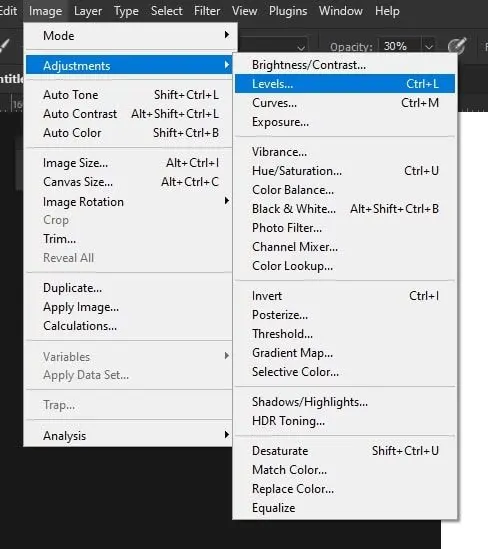
Levels Adjustment
The Levels Adjustment is one of the simplest and most useful tools for basic color correction in Photoshop.
It helps you control the tonal range of an image by adjusting:
- black point
- white point
- midtones
This is especially helpful when a photo looks dull, faded, or low-contrast.
Adjusting Brightness and Contrast
Levels is a good starting point for adjusting brightness and contrast because it lets you anchor the darkest and brightest parts of the image first.
When used properly, it can:
- Brighten underexposed photos
- Improve contrast without overdoing it
- Restore depth to flat-looking images
- Create cleaner tonal separation
A common beginner mistake is pushing contrast too hard right away. In my experience, a small correction usually works better than a dramatic one.
Fixing Tonal Range
Tonal range refers to how your image uses shadows, midtones, and highlights.
If the tonal range is weak, the image can look washed out. If it is too aggressive, details may disappear in bright or dark areas. Levels helps you bring those tones into a better balance so the image feels clearer and more natural.
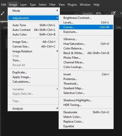
Curves Adjustment
The Curves Adjustment gives you more precision than Levels and is one of the most powerful tools in Adobe Photoshop.
Curves allow you to fine-tune:
- highlights
- midtones
- shadows
- contrast
- color channels
Once you get comfortable with Curves, it usually becomes one of the most important tools in your photo editing workflow.
Fine Control Over Highlights, Midtones, and Shadows
What makes Curves so useful is its flexibility. Instead of adjusting the entire image broadly, you can target specific tonal areas.
For example, you can:
- brighten midtones without blowing out highlights
- deepen shadows without crushing them
- Add contrast with more control
- refine the image gradually
In practice, Curves is where a lot of “good” edits turn into “professional-looking” edits. It gives you control without forcing blunt changes.
Auto Color Correction
Photoshop also includes automatic correction tools like:
- Auto Tone
- Auto Contrast
- Auto Color
These are helpful when you want a fast starting point or a quick preview of what the image might need.
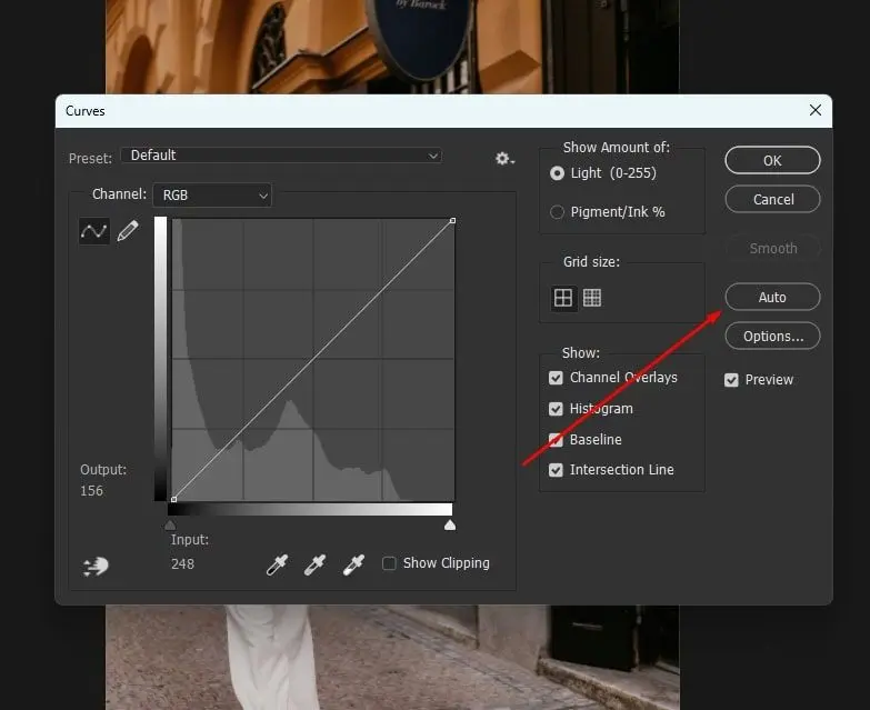
Using Photoshop’s Automatic Correction Tools
Auto tools can sometimes fix obvious issues quickly, especially when an image has a noticeable color cast or poor tonal balance.
A simple way to use them is:
- Open the image in Photoshop
- Go to the Image menu
- Test Auto Tone, Auto Contrast, or Auto Color
- Compare the result to the original
- Refine manually with adjustment layers
I’ve noticed that Auto Color works best as a first pass, not as a finished solution. Sometimes it gets surprisingly close. Other times, it creates new problems. Always judge the result visually.
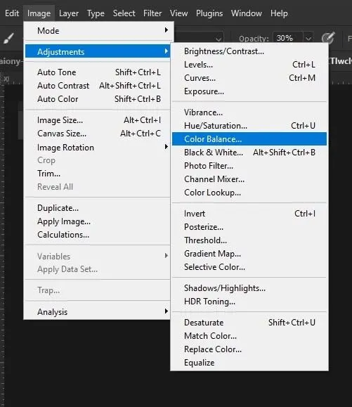
Color Balance Tool
The Color Balance Tool helps you adjust the overall color tone of an image by targeting separate tonal regions:
- shadows
- midtones
- highlights
It is especially useful when an image feels too warm, too cool, or uneven across different brightness levels.
Adjusting Overall Color Tones
With Color Balance, you can shift:
- cyan and red
- magenta and green
- yellow and blue
This makes it easier to fix color casts without changing the whole image too aggressively.
For example, you might:
- Add warmth to midtones for more natural skin
- cool shadows slightly for cleaner depth
- Reduce yellow in highlights for a more neutral result
Because it works by tonal region, Color Balance is useful in both correction and grading.
Advanced Color Correction Tutorial
Camera Raw Filter
The Camera Raw Filter is one of the best Photoshop tools for advanced color correction.
It gives you broad control over:
- exposure adjustment
- white balance
- contrast control
- highlights and shadows
- clarity and texture
- vibrance and saturation
For many photos, this is the fastest place to clean up the image before moving into more detailed Photoshop adjustments.
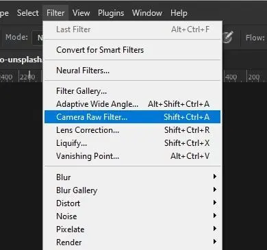
Advanced Control Over Exposure, Clarity, and Color
Camera Raw Filter is especially useful when the image needs multiple corrections at once.
You can use it to:
- recover bright highlights
- open up blocked shadows
- adjust color temperature
- refine overall contrast
- improve detail and clarity
In practice, this tool is excellent for early-stage image enhancement because it lets you make big foundational changes quickly without committing to destructive edits.
Hue/Saturation Adjustment
The Hue/Saturation Adjustment helps control how strong colors appear and lets you target specific color ranges.
It is useful when a photo has colors that are:
- too intense
- too dull
- slightly shifted
- distracting in one specific area
Adjusting Intensity and Specific Color Ranges
Instead of increasing saturation globally, it is usually better to edit individual colors.
For example:
- Reduce greens if foliage looks too electric
- soften reds if skin looks too intense
- tone down the blues if the skies feel unnatural
One mistake I see often is global oversaturation. It can make an image feel fake very quickly. More color does not automatically mean better color.
Selective Color Adjustment
The Selective Color Adjustment is one of the most useful tools for refining specific colors in Photoshop.
It lets you adjust cyan, magenta, yellow, and black within individual color groups, like:
- reds
- yellows
- greens
- cyans
- blues
- magentas
- neutrals
- whites
- blacks
Fine-Tuning Individual Colors
Selective Color is especially effective for:
- improving skin tones
- refining sky color
- balancing greens in landscapes
- controlling neutral shadows
- cleaning up subtle color contamination
In my experience, this is one of the tools that gives editors much more control once they move beyond basic photo editing. It is precise, flexible, and very useful for problem-solving.
Match Color Feature
The Match Color feature helps one image take on the color characteristics of another.
This is useful when you are working with:
- photo sets shot under different lighting
- product photos that need consistency
- portrait sessions with changing color temperature
- series of images that need a unified look
Matching Color Tones Between Images
Match Color can save time when consistency matters more than building every correction manually.
It does not always produce a perfect result, but it can give you a strong starting point when you need multiple images to feel visually connected.
What Is Color Grading in Photoshop?
Color grading in Photoshop is the creative process of styling an image after color correction is complete.
While color correction focuses on accuracy, color grading focuses on mood.
This is where you shape things like:
- cinematic tone
- warm and cool balance
- visual atmosphere
- artistic style
- storytelling through color
The simplest difference is this:
- Color correction fixes the image
- Color grading styles the image
That distinction is important. A corrected image looks clean. A graded image looks intentional.
Photoshop Color Grading Tutorial
Gradient Map Adjustment
The Gradient Map Adjustment is one of the most powerful tools for Photoshop color grading.
It maps chosen colors across the tonal range of the image, which makes it especially good for stylized looks.
Applying Cinematic Color Styles
A common cinematic approach is:
- cooler shadows
- warmer highlights
- softer color transitions through the midtones
This kind of tonal separation can create a very polished result, especially when the effect is subtle.
I’ve found that Gradient Maps work best when the opacity is reduced or the blending mode is adjusted. At full strength, they often feel too obvious.
Photo Filter Adjustment
The Photo Filter Adjustment is a simple but very effective way to warm or cool an image.
It is useful for:
- adding warmth to portraits
- cooling down moody images
- creating a subtle atmosphere
- shifting overall color temperature
Adding Warm or Cool Tones
Warm tones often make an image feel:
- inviting
- nostalgic
- soft
- cinematic
Cool tones often make an image feel:
- modern
- dramatic
- clean
- distant
Photo Filter is not the most advanced tool in Photoshop, but it is one of the easiest ways to create a gentle mood shift without overcomplicating the process.
Split Toning (Color Toning)
Split toning means applying different colors to highlights and shadows.
This is a classic color grading technique because it introduces tonal contrast without relying only on brightness changes.
Applying Different Colors to Highlights and Shadows
A common example is:
- blue in the shadows
- orange or yellow in the highlights
In Photoshop, you can create this look with:
- Color Balance
- Gradient Map
- Curves using color channels
This is often how editors create a cinematic color grading style. The key is subtlety. Strong split toning can look trendy for a moment, but dated very quickly.
Creating and Using LUTs
LUTs (Look-Up Tables) are preset color transformations that apply a grading style quickly.
They are useful for:
- previewing creative looks
- maintaining consistency
- speeding up workflow
- testing visual direction
Applying Professional Color Grading Presets
LUTs can be helpful, but they are rarely perfect on their own.
In practice, the better approach is to:
- Apply the LUT
- reduce the opacity
- refine the result with Curves, Color Balance, or Selective Color
That gives you a more polished grade instead of a generic preset look.
Step-by-Step Color Grading Process
Start After Color Correction
Always begin color grading after the image has already been corrected for:
- white balance
- exposure
- contrast
- tonal balance
- color casts
This gives the grade a clean base to work from.
Apply Grading Tools Gradually
Build the look one step at a time instead of stacking strong effects all at once.
A practical grading workflow could be:
- Correct the image fully first
- Add a Color Balance adjustment
- test a Photo Filter or Gradient Map
- refine problem colors with Selective Color
- Apply a LUT only if it supports the image
- Reduce opacity until the result feels natural
This kind of gradual workflow gives you much more control.
Balance Tones and Maintain Consistency
As you build the grade, keep checking:
- skin tones
- highlight quality
- shadow detail
- overall color harmony
- consistency across the frame
One common mistake is pushing the look so far that the photo loses clarity. A good grade should support the image, not overpower it.
Adjust Opacity for Subtle Results
Opacity is one of the most underrated controls in Photoshop.
A grade that feels too strong at 100% often looks much better at 20% to 50%. In my experience, subtle color grading usually feels more professional because it enhances the image without shouting.
Common Mistakes to Avoid
Grading Before Correcting
This is one of the biggest workflow mistakes. If the image still has exposure or white balance problems, the grade usually makes them worse.
Over-Editing
Too much contrast, too much saturation, or overly heavy color shifts can make the image feel artificial very quickly.
Using Too Much Saturation
Oversaturation is one of the fastest ways to make an edit look cheap. It is usually better to control individual colors than to boost everything globally.
Crushing Shadows Too Hard
Dark shadows can look dramatic, but once the detail is gone, it is difficult to recover. This is especially important in portraits and product images.
Ignoring Natural Skin Tones
Skin tones are one of the first things viewers notice. Even a creative grade needs believable skin, unless the image is intentionally stylized.
Applying LUTs Too Strongly
LUTs are useful, but heavy preset looks often feel generic. They work better as a starting point than a final result.
More Tips for Effective Color Correction and Grading
Maintain Natural Skin Tones
Even when you are aiming for a cinematic look, skin tones usually need careful protection. If skin starts looking too orange, pink, green, or gray, the whole image feels wrong.
Use Adjustment Layers for a Non-Destructive Workflow
A non-destructive editing workflow is essential in Photoshop.
Use:
- adjustment layers
- layer masks
- smart objects
This makes it easier to revise, reduce, or remove any edits later.
Compare Before and After Results
Turn your correction and grading layers on and off regularly. This helps you see whether the image is actually improving or just becoming more dramatic.
Use Reference Images
Reference images help keep your color decisions intentional.
They are useful for judging:
- color temperature
- contrast level
- tonal mood
- saturation style
- overall consistency
I’ve noticed that using references reduces random edits and helps create a more controlled final look.
Keep Correction Layers Separate From Grading Layers
This is a simple workflow habit, but it makes a big difference. When correction and grading are organized into separate groups, it is easier to troubleshoot and refine each stage.
Make Subtle Adjustments
Small adjustments usually age better than extreme ones. Subtle editing gives you a cleaner and more professional result.
Best Photoshop Workflow for Beginners
If you are new to Photoshop, the easiest workflow is:
- Start with white balance
- fix exposure and tonal range
- correct distracting colors
- move into color grading only after correction is done
- Save your layered PSD file for future edits
This order keeps the process manageable and helps you avoid the common mistake of styling an image before it is technically clean.
Wrapping Up
Color correction and color grading in Photoshop work best when they are treated as two connected but separate processes.
Color correction fixes the image. It handles exposure, white balance, contrast, tonal range, and color accuracy. Color grading builds on that foundation and shapes the final mood, color tone, and artistic direction.
The more you practice this workflow, the easier it becomes to see what an image actually needs. Over time, you stop relying on random adjustments and start making better decisions with more control.
Key Takeaways
- Correct first, grade second: Fix technical issues before adding any creative style.
- Use the right tool for the right job: Levels, Curves, Camera Raw Filter, Selective Color, Gradient Map, Photo Filter, Match Color, and LUTs all serve different roles.
- Keep everything editable: A non-destructive workflow makes it easier to refine your results and improve your consistency.
Final Thoughts
Professional-looking images usually do not come from aggressive effects. They come from controlled corrections, intentional grading, and a workflow that respects both the technical and creative sides of photo editing.
FAQ
What is the difference between color correction and color grading in Photoshop?
Color correction fixes technical issues like exposure, white balance, contrast, and color casts. Color grading is the creative process of changing the mood, style, and overall color tone after the image has already been corrected.
Which Photoshop tool is best for color correction?
There is no single best tool for every image, but Levels, Curves, Camera Raw Filter, Color Balance, and Selective Color are some of the most useful. Each one solves a different part of the correction workflow.
Can beginners learn color grading in Photoshop?
Yes. Beginners can start with basic tools like Levels, Curves, and Color Balance, then move into more advanced grading tools like Gradient Map, Photo Filter, and LUTs as they become more comfortable.
Should I use LUTs in Photoshop?
LUTs can be useful as a starting point for color grading because they apply a look quickly. But they usually work best when combined with manual adjustments instead of being used at full strength.
Why do my edited photos look unnatural?
This often happens because of over-editing, poor white balance, too much saturation, or grading before correction. Unnatural skin tones and crushed shadows are also common reasons.
Is non-destructive editing important in Photoshop?
Yes. Non-destructive editing lets you change or remove adjustments at any time without damaging the original image. It is one of the most important habits in a professional Photoshop workflow.