Shoppers judge products in milliseconds; in fact, 93% of consumers rely on product images to make purchasing decisions.
Background colors are the visual foundations of e-commerce photography because they dictate contrast, guide user experience (UX), and establish brand trust. Using the correct backdrop ensures your product details are clear, appealing, and compliant with marketplace guidelines.
Here is the ultimate guide to choosing the best background colors to improve customer experience, boost sales, and grow your business.
What are the most effective background colors for products?
The most effective background colors range from pure white to sophisticated blacks, depending on the item and audience. Testing shows that aligning the color palette with your product category builds trust and helps shoppers clearly see textures, ultimately driving higher click-through rates.
White Backgrounds (The E-commerce Standard)
Almost 76% of online product images use a pure white background. It offers a clean, distraction-free canvas that shows professionalism. Most importantly, it satisfies primary image rules for marketplaces like Amazon. Tip: If selling light-colored items, use shadows to create contrast so the product doesn’t blend in.
Gray Backgrounds (Sophisticated Neutrals)
Gray offers a neutral, sophisticated tone. It works practically for colorful gadgets and white items, providing contrast without being harsh. However, gray is not recommended for dull-colored products, as it can make them appear less vibrant.
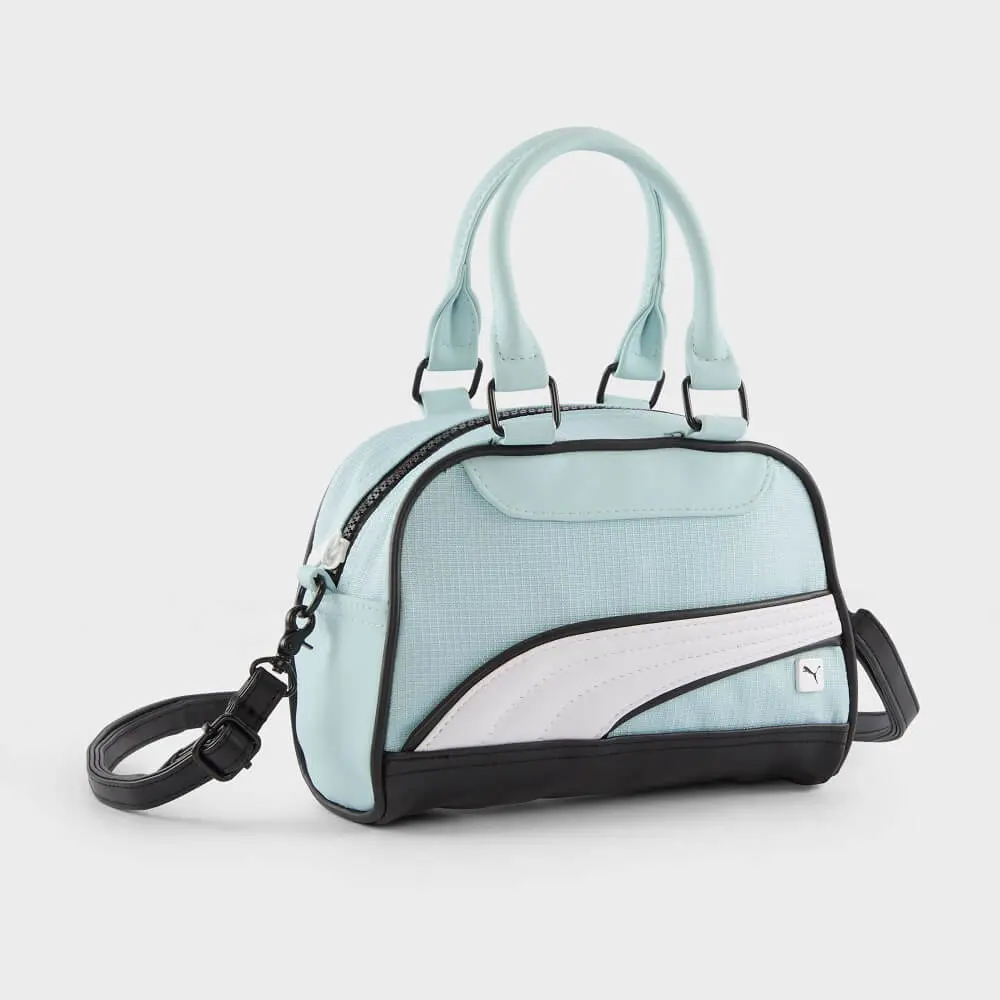
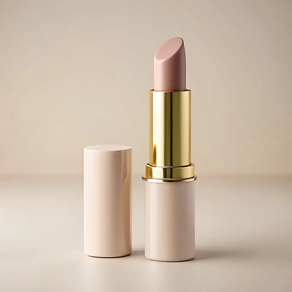
Beige & Off-White Backgrounds (Warm and Earthy)
Beige adds a natural, soothing aesthetic perfect for skincare and earthy leather goods. Off-white provides soft contrast and beautifully suits any skin-tone-colored model in lifestyle shots.
Blue Backgrounds (Calming and Trustworthy)
Blue builds a serene sense of trust and security. It creates an elegant look for jewelry, fitness gear, and healthcare items while making warm-toned products (like yellow or orange) stand out.

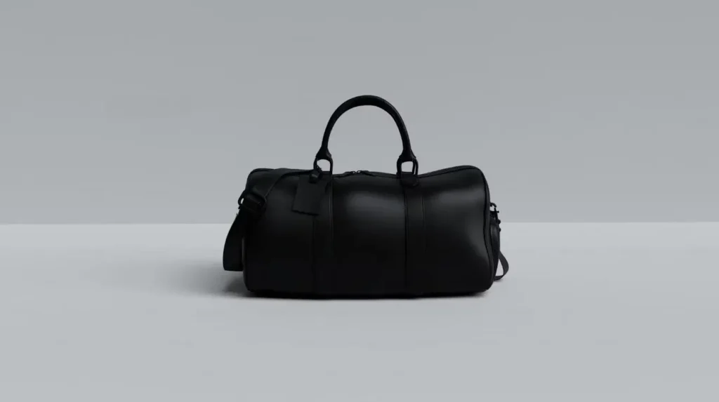
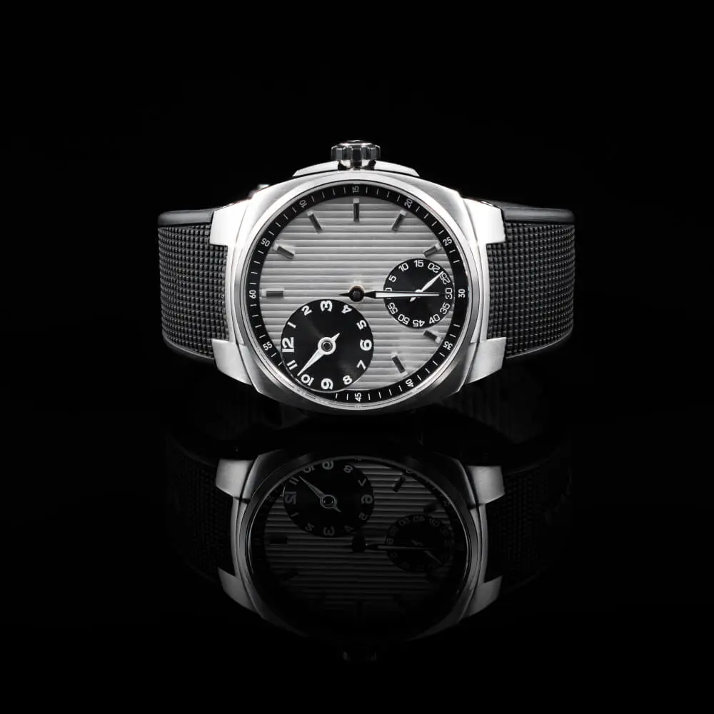
Black Backgrounds (Bold and Luxurious)
Black adds a striking sense of luxury. It highlights shiny surfaces, metals, and glass, making premium accessories look highly valuable by drawing attention to textures.
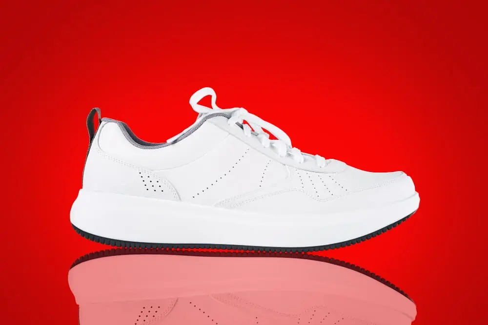
Red Backgrounds (High Drama)
Red shows excitement and urgency. It is highly practical for bold statements or sale banners rather than standard catalog shots, as it can easily overpower the item.
Pastels, Greens, and Warm Tones (Psychological Triggers)
- Green: The most comfortable color for human eyes to process.
- Yellow & Orange: Yellow provides clarity and eye-catching warmth, while orange creates a strong sense of buyer confidence.
- Pink & Purple: Pink relates to romanticism and femininity, making it specific for children’s and women’s products. Purple offers a soothing shopping experience but requires high contrast to present the product accurately.
Gradients and Color Blocks
You are not restricted to single colors. Using gradients, patterns, or color blocks can add depth and guide the viewer’s eye, provided they complement the website design and do not overpower the item.
How do you choose the right product background?
Selecting a background requires balancing color theory, consumer psychology, and specific platform restrictions. You must evaluate whether a warm or cool tone matches your visual merchandising goals, maintain visual hierarchy, and ensure the backdrop complements your overall website design layout.
Follow this practical process to finalize your visual assets:
- Apply Color Theory: Maintain high contrast to catch the viewer’s attention and improve visibility. Dark backgrounds with light products (or vice-versa) make the item pop, while low contrast creates a soft, minimalistic appearance.
- Evaluate Consumer Psychology: Use color tones strategically. Warm tones create warmth and urgency, while cool tones offer a calming effect ideal for wellness items.
- Align with the Product Type: Tailor the backdrop to the subject. Bags allow for creative freedom with textured backdrops to add depth, while shoes require a neutral, clean canvas to let the design details shine.
- Audit Platform Requirements: Review marketplace guidelines before shooting. Platforms like Amazon strictly require a white or off-white background for primary images.
- Establish Visual Hierarchy: Ensure there is a balance between the background and the product. A strong backdrop must never take attention away from the actual product.
Category-Specific Background Performance
| Product Category | Recommended Background Color | Core Reason |
| Jewelry & Watches | Black or Blue | Accentuates metallic sheen and creates a striking, elegant appearance. |
| Bags & Leather Goods | Textured Beige or Gradients | Adds depth, luxury, and warmth without overpowering the product. |
| Shoes & Footwear | Neutral White or Gray | Provides a clean canvas that allows the shoe’s design, color, and details to shine. |
| Cosmetics & Skincare | Off-White or Pastels | Suits skin-tone models and communicates a soothing, natural aesthetic. |
How should you test and edit product images?
Finding the best background requires practical A/B testing and proper photo editing. We tested multiple setups and found that relying on data, rather than assumptions, is the only reliable way to validate an image’s impact on online sales.
- A/B Testing Your Backgrounds: Test a solid white background against gradients or complementary colors. Track the customer engagement to see which specific layout builds the most trust.
- Tools of the Trade: While modern AI background removal tools exist, precision matters for e-commerce. Understanding how to Change Background Color in Photoshop will give you the complete creative control needed to build compelling product images.
FAQs
Why is a white background the standard for e-commerce?
Almost 76% of online product photos use a white background because it minimizes distractions and highlights the product’s details. It also meets the strict primary image requirements for major marketplaces like Amazon.
Can I use multiple colors for a product background?
Yes, using gradients, patterns, or color blocks can add depth and create a more engaging appearance. However, you must choose complementary combinations that guide the eye toward the product without overpowering it.
Do specific colors affect consumer psychology?
Yes, colors evoke specific emotions; for example, green is the most comfortable color for the eyes to process, while blue evokes feelings of trust and security. Using the right tone aligns the product with the customer’s desired emotional state.
The Bottom Line
- Focus on the product: Ensure the background maintains high contrast to make details clear and build audience trust.
- Match the mood: Use consumer psychology, like warm yellows for clarity or pastels for a feminine touch, to evoke the right emotion.
- Stay consistent: Maintain a cohesive visual layout across your website design while adhering to strict marketplace rules.
Ready to optimize your catalog? Start by testing new neutral backgrounds on your top-selling items to improve customer experience, or read a dedicated tutorial on How to Change Background Color in Photoshop to master your visual presentation today.