First impressions in real estate happen online, and color accuracy can make or break a listing. When property photos display inaccurate hues, potential buyers lose trust before they ever schedule a showing. Research shows that listings with high-quality photos receive 118% more online views compared to those with lower-quality images, making proper color correction essential for success.
Interior Color Correction Tips for Real Estate Photos transform ordinary images into compelling visuals that showcase properties authentically. Whether you’re dealing with yellow tungsten lighting or blue window light, the right techniques ensure your listings stand out in a crowded market.
What Is Interior Color Correction in Real Estate Photography?
Color correction adjusts the colors, tones, and white balance of an image to ensure accurate and visually appealing results. Unlike color grading, which creates artistic moods, color correction focuses on bringing the photo up to a color standard that is defined by an even distribution of light, an even tone of color, and the correct representation of colors between the picture and the actual site.
For real estate interiors, “true-to-life” colors matter more than stylized edits. When buyers view property photos, they expect what they see online to match what they’ll encounter during showings. 63% of real estate agents acknowledge that high-quality photography is essential to their success and the sale of properties, and accurate colors build that crucial trust.
Common Color Problems in Interior Real Estate Photos
Interior spaces present unique color challenges that need careful correction:
Yellow casts from tungsten lighting create unwanted warm tones across walls and ceilings. These incandescent bulbs shift the entire color temperature, making white walls appear dingy.
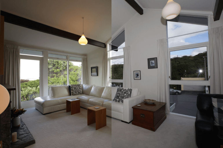
Blue casts from window light occur when natural daylight dominates the scene, giving interiors a cold, uninviting appearance that contradicts the warmth buyers seek.
Green and magenta shifts from mixed lighting happen when fluorescent lights combine with other sources. Real estate photography involves a cacophony of lights that will vary from property to property, making it challenging to get the correct color.
Over-saturated walls and floors result from aggressive editing, creating artificial-looking spaces that damage credibility.
Dull or muddy tones make beautiful properties appear neglected, with colors losing their vibrancy and appeal.
White Balance: The Foundation of Accurate Interior Colors
White balance serves as the first critical step in color correction. Cameras often misjudge it in mixed lighting scenarios, causing color casts—blue shadows, yellow walls, or other unnatural tints.
Start by identifying neutral surfaces like white walls, ceilings, or baseboards. These provide reference points for accurate color calibration.
Gray card and color checker workflow offers the most reliable approach. Photograph a gray card in each room under the actual lighting conditions. During editing, use this reference to establish perfect white balance for that specific space.
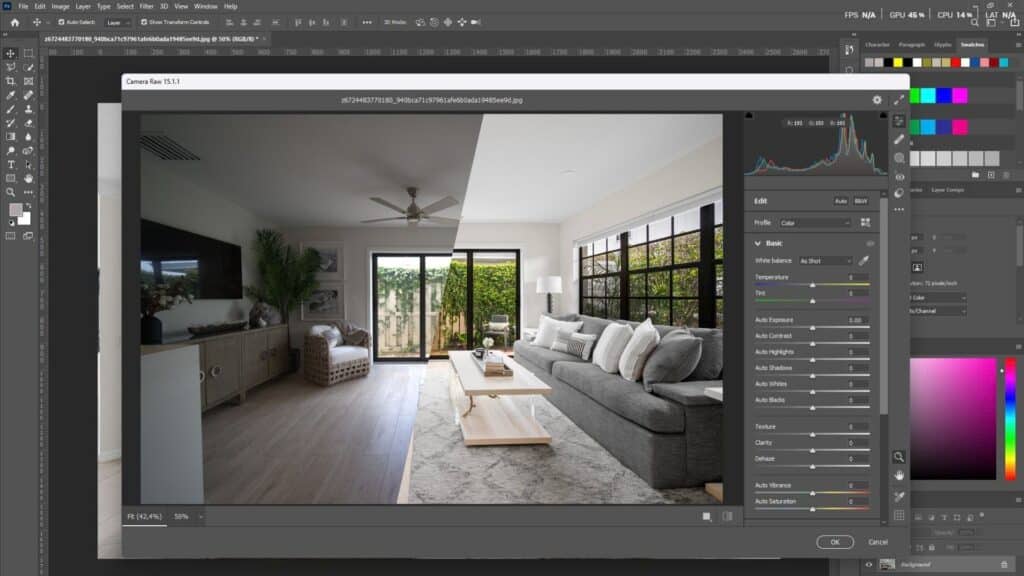
In Photoshop, the “Neutralize” option within the Match Color tool removes color casts effectively. Use the white balance selector tool in your editing software, choose a neutral gray or white area in the image as a reference, and fine-tune temperature and tint sliders for precise adjustments.
Lightroom’s white balance tools provide similar functionality. Use the eyedropper on neutral objects like white cabinets or silver appliances to instantly correct color temperature.
How to Handle Mixed Lighting in Interior Spaces
Mixed lighting represents one of the biggest challenges in interior real estate photography. Natural light through windows clashes with artificial indoor lights, creating competing color temperatures within a single frame.
Ambient-only vs flash-assisted shooting offers different solutions. Ambient-only shooting captures the existing light but often results in strong color casts. Flash-assisted techniques provide more control over the final color temperature.
The Flambient technique combines flash with ambient light exposure. This method blends flash-lit interiors with ambient window light, creating balanced, natural-looking results. Using flash allows you to supplement or even out ambient lighting, thereby creating a unified light temperature across the room.
Local adjustments for warm and cool zones become necessary when different areas display conflicting color temperatures. Create adjustment layers with masks to selectively cool down warm tungsten corners while keeping window areas neutral. We often blend two white balance versions—one corrected for the room interior, another for the natural light coming through windows—and mask them together.
Balancing Exposure and Contrast for Clean Interior Colors
Proper exposure balance preserves color accuracy while revealing architectural details. Overexposed areas lose color information, while underexposed regions appear muddy.
Shadow lifting without washing colors requires restraint. Gently raise shadows to reveal details in dark corners, but avoid pushing too far, which desaturates colors and creates a flat appearance.
Highlight recovery near windows prevents blown-out views while maintaining interior brightness. Lower highlights to preserve the view outside windows, a technique often achieved through HDR blending.
HDR blending and manual exposure blending both serve this purpose. HDR merging combines multiple exposures automatically, while manual blending offers more precise control over how exposures merge. Both maintain color depth while creating evenly lit rooms that feel inviting rather than artificially bright.
Targeted Color Adjustments Using HSL & Masks
Global adjustments fail in interiors because different elements require individual treatment. The HSL (Hue, Saturation, Luminance) panel provides the precision needed for professional results.
Boosting wood floor luminance enhances natural tones without oversaturation. Increase the luminance of browns to make hardwood floors look richer and more inviting.
Enhancing greens and blues naturally brings life to plants and pool views. Subtly boost these colors without creating the plastic-looking saturation that screams “overprocessed.”
Using adjustment layers and masks enables non-destructive, targeted edits. Create Color Balance or Selective Color layers, then use masks to apply corrections only where needed—warm walls but not cool window views.
Selective desaturation of shadows prevents color buildup in darker areas. Slightly reducing saturation in shadows while maintaining color in well-lit subjects creates visual depth without artificial contrast.
Using Scopes, Histograms, and Visual Tools for Precision
Professional color correction relies on objective measurements, not just visual judgment. Using the right color space, specifically sRGB, when editing real estate photos ensures your photos appear consistent and correct on your client’s screens and across different platforms.
RGB histogram basics reveal color channel distribution. When red, green, and blue channels align in neutral areas, color balance is accurate. Separated channels indicate color casts.
Identifying color imbalance visually through vectorscopes shows color distribution. Neutral tones cluster at the center, while color casts pull the display toward specific hues.
Avoiding color clipping protects highlight and shadow detail. When histograms show spikes at either extreme, you’re losing color information that cannot be recovered.
Maintaining Consistency Across Real Estate Listings
Brand trust develops through consistency. When colors are true to life across an entire property listing, it creates a cohesive, professional impression that reflects well on both you and your client.
Apply synced settings across similar rooms within a shoot. If the kitchen white balance works perfectly, apply those settings to other rooms with similar lighting before making fine adjustments.
Create and use presets responsibly. Develop baseline presets for common scenarios—bright living rooms, dim bedrooms, mixed-light kitchens—but always customize for each specific space.
Match color temperature from room to room so the entire property feels cohesive. Buyers should experience a seamless visual journey through the listing, not jarring shifts between warm and cool spaces.
Screen Calibration and Cross-Device Color Accuracy
Colors appear differently across devices, creating a hidden challenge for real estate photographers. Viewers spend 60% of the time checking images, and only 20% read the listing description, making accurate color display crucial.
Calibrated displays provide the foundation for accurate editing. Without calibration, you’re making color decisions based on inaccurate information. Professional colorimeters measure and adjust your monitor to industry standards.
Test edits on multiple devices before delivery. View your corrections on at least two different screen types—a calibrated monitor and a smartphone. Most buyers browse listings on mobile devices, where colors may shift significantly.
Optimize colors for MLS and web platforms by working in the sRGB color space. Larger spaces like Adobe RGB contain colors that web browsers cannot display, leading to unexpected color shifts when listings go live.
Perspective & Line Correction (Supporting the Color Work)
Straight lines enhance perceived color accuracy by creating professional, trustworthy images. Fixing verticals is non-negotiable. Use the Transform tools in Lightroom or Photoshop’s Perspective Warp to correct converging lines.
Why do straight walls improve color perception? When verticals lean, the entire image feels “off,” and viewers unconsciously distrust all aspects of the photo, including colors. Correcting perspective validates the accuracy of your color work.
Lightroom’s automatic perspective tools identify and correct distortion quickly. The Upright feature analyzes the image and straightens horizontal and vertical lines with a single click, though manual fine-tuning often improves results.
Quick Interior Color Correction Workflow (Step-by-Step)
Professional color correction follows a systematic approach:
Step 1: Shoot with correct intent – Plan your lighting strategy during the shoot, not during editing. Capture multiple exposures if needed.
Step 2: Capture gray card reference – Photograph a gray card in each room for accurate calibration references.
Step 3: Set white balance – Use your gray card reference to establish neutral white balance as your foundation.
Step 4: Balance exposure – Adjust shadows and highlights to reveal detail throughout the frame while maintaining color depth.
Step 5: Refine colors with masks – Apply targeted HSL adjustments and use masks for area-specific corrections.
Step 6: Final consistency check – Review the entire set to ensure cohesive color temperature and tone across all images.
Common Mistakes to Avoid in Interior Color Correction
Over-warming interiors makes spaces feel stuffy rather than inviting. While warmth can be appealing, excessive yellow casts suggest poor lighting rather than coziness.
Excessive saturation creates the dreaded “plastic look” that damages credibility. Be mindful not to overcorrect and make materials look different from how they do in real life.
Ignoring mixed lighting leads to unnatural color variations within single frames. Address competing light sources rather than applying global corrections that fail everywhere.
One-click presets without adjustments rarely produce professional results. Presets provide starting points, but each property requires customization based on specific lighting conditions.
Over-processing for “Instagram look” prioritizes style over accuracy. Real estate buyers want truth, not artistic interpretation. Vibrant but realistic colors sell properties better than heavily stylized images.
Professional Color Correction vs DIY Editing
Time versus quality presents a constant trade-off. Spending 20–30 minutes per image isn’t sustainable when you’re shooting five properties a week. That’s 15+ hours of editing time—every week.
Whether outsourcing makes sense depends on your business model. Photographers who excel at capturing images but struggle with editing efficiency benefit most from professional editing services. The hours saved allow more shoots, which often generate higher revenue than learning advanced editing techniques.
Benefits extend across roles. Agents receive consistent, professional images without hiring photographers. Photographers focus on shooting while maintaining quality output. Professional editors specialize in efficiency, delivering results faster than most photographers can edit themselves.
FAQs On Interior Color Correction Tips
What is the best white balance for interior real estate photos?
The best white balance for interior real estate photos depends on the lighting in each specific room. For spaces with primarily tungsten lighting, set white balance around 3200K. For rooms with natural daylight, use daylight settings near 5500K. For mixed lighting, use a gray card reference and adjust manually to achieve neutral whites. The goal is to make white surfaces appear truly white without yellow or blue casts.
How do you fix yellow walls in real estate photos?
Fix yellow walls by first adjusting white balance toward cooler temperatures (increasing the blue slider). Use the eyedropper tool on a neutral surface that should be white or gray. If global adjustments affect other areas negatively, create a Selective Color adjustment layer targeting yellows specifically, reducing their intensity. For severe casts, use Color Balance adjustment layers with masks to correct only the affected walls.
Should real estate photos be warm or neutral?
Real estate photos should be neutral with a slight warmth that feels natural and inviting. Completely neutral images can appear cold and sterile, while overly warm images look inaccurate. Aim for white balance that makes whites appear clean but includes enough warmth to create welcoming, lived-in spaces. The lighting should match what viewers would experience during an actual property visit.
What software is best for interior color correction?
Adobe Lightroom excels at batch processing and quick color corrections across multiple images. Adobe Photoshop offers more advanced control for complex mixed-lighting situations and targeted adjustments using layers and masks. For HDR blending with color correction, Photomatix Pro specializes in merging multiple exposures while maintaining accurate colors. Most professional real estate photographers use a combination of Lightroom for workflow efficiency and Photoshop for detailed corrections.
How do I remove the blue tint from the window light?
Remove blue tint from window light by increasing the white balance temperature slider (adding warmth) or reducing the blue channel. Use local adjustment brushes or masks to target only the areas affected by window light rather than warming the entire image. Alternatively, create a Color Balance adjustment layer, add warmth to shadows and midtones, then mask the adjustment to affect only the blue-tinted areas near windows.
Why does color consistency matter across property photos?
Color consistency creates professional, trustworthy listings that buyers can rely on. When each room displays different color temperatures, the property feels disjointed, and the photos appear amateurish. Consistent colors help buyers visualize flowing through the space naturally. This cohesive presentation increases engagement and builds confidence in both the property and the professionals marketing it.
Creating Natural, Inviting Interior Photos That Sell
Interior Color Correction Tips for Real Estate Photos center on one principle: authenticity sells properties. When buyers trust that photos accurately represent spaces, they engage more deeply with listings.
Realism trumps artistic flair in real estate. Beautiful corrections enhance without deceiving, creating images that fulfill their promises during showings. This builds a reputation for both agents and photographers.
The final takeaway for achieving real estate success lies in consistently applying these principles. Each correction should ask: “Does this make the property look like itself on its best day?” When the answer is yes, your color correction serves its purpose perfectly.
Suggested Reads for Real Estate Photo Editors
To deepen your skills and improve listing performance, check out these related guides:
Common Real Estate Photo Editing Problems & Their Solutions
A breakdown of typical editing challenges — from exposure issues to perspective distortion — and practical fixes that preserve realism and listing credibility. Read more about common editing pitfalls and solutions
How to Replace Skies in Real Estate Photos
Learn when and how to replace dull or blown-out skies in exterior shots with natural-looking replacements, including AI tools and Photoshop techniques that improve curb appeal without looking fake. Explore sky replacement techniques for property photos
Best Software for Real Estate Photo Editing
A roundup of professional tools and software used by real estate photographers and editors to speed up workflows and deliver consistent, high-quality results across interior and exterior photos. See top software picks for real estate editing
Why Real Estate Listings Fail Without Proper Photo Editing
Understand how poor editing — like inconsistent white balance and over-processing — can harm buyer trust and reduce engagement, and how strategic edits make listings more compelling. Learn why good editing matters for listings
Why Real Estate Photo Editing Matters in a Competitive Market
Insight into the strategic value of professional-quality editing for standing out in crowded markets and increasing inquiries, views, and showings. Discover the importance of high-quality photo editing