

A lot of editors hit the same wall at some point: the footage is shot, the edit is done, a LUT gets applied, and somehow the result still looks off. Maybe the skin tones feel strange, or one shot looks warmer than the next. Maybe the whole thing feels styled, but not polished.
That usually happens when color correction and color grading get treated like the same thing. They’re not.
Color correction fixes technical problems. Color grading shapes the visual mood. One gives you a clean, consistent image. The other gives that image tone, atmosphere, and identity.
Once that distinction clicks, post-production gets a lot easier. You stop throwing looks at broken footage and start building from a solid base.
In this guide, you’ll learn what color correction and color grading actually mean, how they work together, and where each one belongs in a practical editing workflow.
What Is Color Correction?
Color correction is the process of fixing footage so it looks balanced, natural, and consistent.
This is the technical side of color work. You’re not trying to make the footage cinematic yet. You’re making sure it looks right first.
That can include fixing exposure, adjusting white balance, improving contrast, controlling saturation, and matching shots from the same scene. If one clip looks too blue, another looks too dark, and a third has skin tones that feel slightly off, correction is where those problems get cleaned up.
A simple way to think about it: color correction is the step that makes your footage usable.
What color correction usually includes
- White balance adjustment
- Exposure balancing
- Contrast refinement
- Highlight and shadow recovery
- Saturation control
- Shot matching across a sequence
Why color correction matters
Even strong footage can fall apart when clips don’t match each other. Viewers may not know why something feels inconsistent, but they notice it immediately.
This usually shows up in small ways:
- interview angles that don’t match
- daylight clips that lean too cool
- indoor shots that skew orange
- faces that look different from one cut to the next
Correction solves those issues before they get amplified by creative styling.
What Is Color Grading?
Color grading is the creative process of giving footage a specific look and emotional tone.
Once the image is technically balanced, grading is where you decide how it should feel. Warm highlights can make a scene feel nostalgic or intimate. Cooler shadows can add distance or tension. Lower saturation can feel gritty. Rich contrast can feel polished and dramatic.
This is where color starts doing storytelling work.
What color grading is meant to do
- Build mood and atmosphere
- Support genre and tone
- Create a recognizable visual style
- Guide how the audience feels about a scene
- Make the final image feel intentional, not just corrected
Common grading tools
- LUTs
- Color wheels
- Curves
- HSL controls
- Split toning
- Secondary color adjustments
- Masks and qualifiers
The important thing here is that grading is not a repair step. It works best when the footage has already been corrected.
Color Correction vs Color Grading: The Simple Difference
The clearest difference comes down to purpose.
Color correction is about accuracy.
Color grading is about emotion.
Here’s a direct comparison:
| Factor | Color Correction | Color Grading |
| Main job | Fix image problems | Create style and mood |
| Focus | Natural, balanced footage | Cinematic or branded look |
| Type of work | Technical | Creative |
| Priority | Consistency and realism | Atmosphere and storytelling |
| Happens when | First | After correction |
Put another way:
Correction makes the footage look clean. Grading makes it feel like something.
That’s why the two are connected, but not interchangeable.
Why So Many People Mix Them Up
Part of the confusion comes from the tools. In most editing software, correction and grading happen in the same panel, with the same wheels, curves, and sliders.
So it’s easy to assume they’re the same task.
But the difference isn’t the tool. It’s the reason behind the adjustment.
If you lift the exposure so that a face is properly visible, that’s a correction.
If you push the shadows slightly teal to create a dramatic tone, that’s grading.
Same software. Similar controls. Completely different purpose.
What Comes First: Color Correction or Color Grading?
Color correction always comes first.
That order matters more than it seems. When you try to grade footage that still has exposure issues or mismatched white balance, the creative look gets harder to control. The result often feels uneven from shot to shot.
A better workflow is straightforward.
1. Finish the edit first
Do not spend time grading clips that might not stay in the timeline. Lock the structure before getting detailed with color.
2. Correct the footage
Balance exposure, fix white balance, improve contrast, and match shots within each scene.
3. Check consistency
Before adding style, make sure the sequence feels visually coherent. Skin tones, brightness, and overall balance should feel stable from cut to cut.
4. Apply the grade
Once the technical foundation is clean, build the creative look. This can be subtle or stylized depending on the project.
5. Fine-tune as needed
A grade rarely lands perfectly across every shot without adjustment. Small refinements are part of the process.
Why You Usually Need Both
A corrected image can still look flat. A graded image built on bad correction can still look messy.
That’s why most polished video work uses both steps.
Color correction gives you reliability.
Color grading gives you personality.
A corporate interview may only need a gentle grade. A music video may lean heavily into stylization. A wedding film might aim for warmth and softness. A documentary may keep things restrained.
The balance changes from project to project, but the logic stays the same: first make it accurate, then decide how far to shape the look.
A Real-World Example
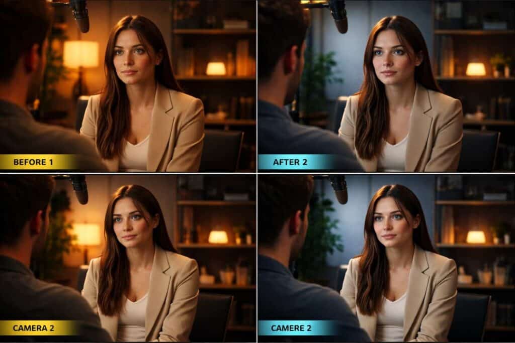
Let’s say you filmed an interview with two cameras in mixed indoor light.
One angle looks slightly warm. The other is flatter and a little cooler. The skin tones shift every time the edit cuts between cameras.
That’s a correction problem first.
During color correction, you would:
- Balance the white balance between both cameras
- Even out the exposure
- Improve contrast
- Match skin tones more closely
- Make the scene feel consistent
Once that’s done, you can move into grading.
During color grading, you might:
- Add warmer midtones for a more welcoming feel.
- Soften contrast slightly for a cleaner interview look.
- Introduce a subtle color palette that matches the brand.
The correction fixes the mismatch. The grade adds intention.
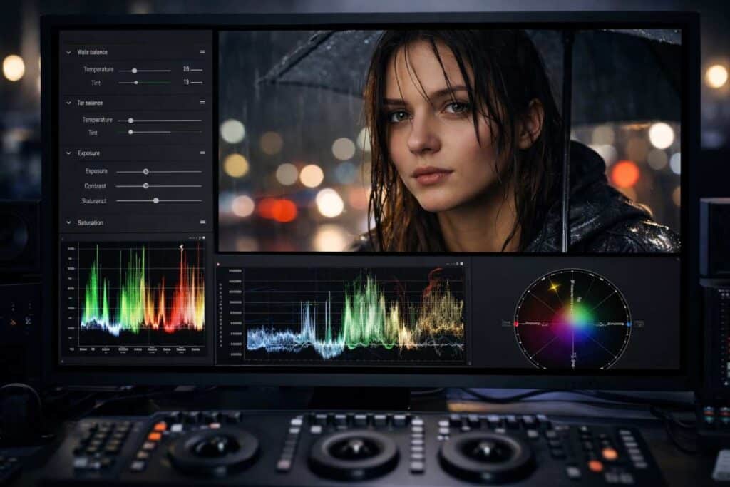
Best Tools for Color Correction and Color Grading
Most modern editing platforms can handle both correction and grading. The right choice depends on how deep you want to go and how your workflow is set up.
DaVinci Resolve
This is often the first recommendation for serious color work, and for good reason. Resolve gives you strong scopes, node-based control, and a grading workflow built around precision.
Adobe Premiere Pro
Premiere Pro works well for editors who want to cut and color in one place. It’s especially practical for content workflows where speed matters.
Final Cut Pro
A strong option for Mac-based editors who want a streamlined editing experience with capable color tools.
Lightroom and Photoshop
These are more relevant for photography, but the same idea applies: correction handles realism, grading handles visual style.
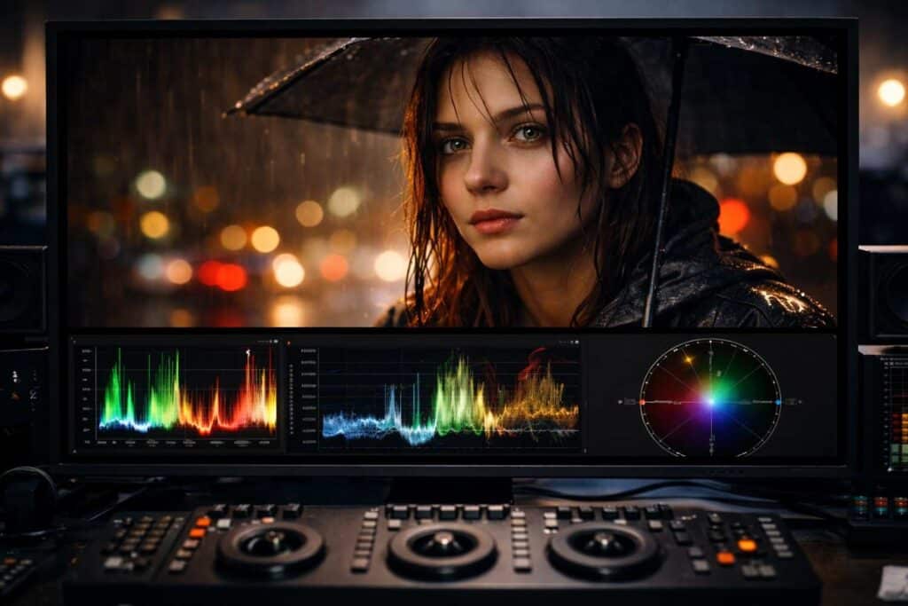
Tools that matter inside any editor
No matter which software you use, a few tools are worth learning early:
- waveform monitor
- vectorscope
- RGB parade
- curves
- color wheels
- HSL controls
- masks
- LUTs
One common mistake is relying only on your eyes. Scopes help you stay objective, especially when you’ve been staring at a screen too long.
Common Mistakes to Avoid
Going straight to LUTs
This is probably the most common shortcut, and it usually backfires. LUTs can be helpful, but they work better as a starting point than a solution.
Overdoing saturation
It’s easy to mistake “more color” for “better color.” In practice, this is where skin tones often start to break.
Ignoring shot matching
A single shot may look great on its own and still feel wrong inside the sequence. Consistency matters as much as style.
Pushing contrast too far
Heavy contrast can look impressive for a moment, then quickly start crushing detail and making footage feel harsh.
Forgetting skin tones
Viewers are incredibly sensitive to faces. Even when the overall grade is stylized, skin still needs to feel believable.
A Few Color Theory Basics Help More Than You’d Think
You do not need a design degree to make better color decisions. A few basics carry a lot of weight.
Hue
Hue is the actual color family, such as red, blue, green, or yellow.
Saturation
Saturation controls how intense or muted that color appears.
Luminance
Luminance is how light or dark the image feels.
Warm vs cool tones
Warm tones often feel inviting, energetic, nostalgic, or intimate.
Cool tones often feel calm, distant, tense, or modern.
This matters because color affects perception before a viewer consciously notices it. A scene can feel softer, heavier, colder, or more emotional just from color choices alone.
When a Subtle Grade Works Better
Not every project needs a dramatic cinematic treatment.
In fact, subtle grading is often the better choice for:
- interviews
- brand videos
- educational content
- product demos
- real estate walkthroughs
- documentary-style edits
In those cases, the goal is usually trust, clarity, and polish. A heavy look can start to feel distracting.
One common mistake is assuming that professional color always means obvious color. It often doesn’t. Sometimes the most effective grade is the one people barely notice.
How to Improve Faster
A useful habit is to separate your thinking into two questions:
What needs to be fixed?
What should this feel like?
That small shift changes the way you work.
It keeps you from using creative styling to hide technical issues. It also makes your grades more intentional, because you’re choosing a mood after the image is already under control.
That’s where color work starts feeling less random.
FAQs
What is the difference between color correction and color grading?
Color correction fixes technical issues like white balance, exposure, and shot consistency. Color grading adds style, mood, and visual tone after the footage has been corrected.
Do you always color correct before color grading?
Yes, that’s the standard workflow. Correction gives you a balanced base, and grading becomes much easier once the footage is already consistent.
Can a LUT replace color correction?
No. A LUT can help create a look, but it does not reliably fix exposure, white balance, or matching issues across clips.
Is color grading necessary for every video?
Not every video needs a heavy grade, but most benefit from at least a subtle one. Even small adjustments can make the final image feel more polished and cohesive.
Which is more important: correction or grading?
Correction comes first because it solves technical problems. Grading matters too, but it works best when the image is already balanced.
Does this apply to photos, too?
Yes. The same basic idea applies in photography. Correction focuses on realism and balance, while grading shapes the overall look and mood.
Conclusion
Color correction and color grading belong together, but they are not the same step.
If you remember only three things, make them these:
- Color correction fixes the image
- Color grading shapes the mood
- The best results come from doing them in that order
The next practical step is simple: take one short clip and do two passes on it. First, correct it until it looks clean and natural. Then grade it with a clear mood in mind.
That exercise makes the difference obvious very quickly, and it’s one of the easiest ways to build better instincts in post.