Your photos are already good. A structured Lightroom workflow is what turns them into images people remember.
Adobe Lightroom photo editing is a non-destructive, RAW-based image post-processing system that gives photographers a repeatable, professional workflow from import to export without permanently altering the original file. It dominates the industry because it combines cataloging, color correction, and output tools in a single, consistent pipeline.
This guide is for photographers at every level beginners who just bought their first mirrorless camera and don’t know where to start, and advanced editors who want to tighten their Lightroom workflow and stop wasting time. By the end, you’ll have a specific, stage-by-stage editing process you can apply to every shoot.
Summary
Adobe Lightroom Photo Editing Guide: Complete Workflow, Tips & Pro Techniques is a structured, beginner-to-advanced guide that covers every stage of the Lightroom editing process from importing and organizing photos, to culling, global adjustments, color correction and grading, AI masking, presets, detail enhancement, and final export settings. It positions Lightroom as a workflow system rather than just a software tool, explaining key concepts like non-destructive editing and RAW processing, while providing specific, actionable techniques (exact slider values, panel sequences, batch editing methods) used by working professionals.
What Makes Adobe Lightroom the Industry Standard?
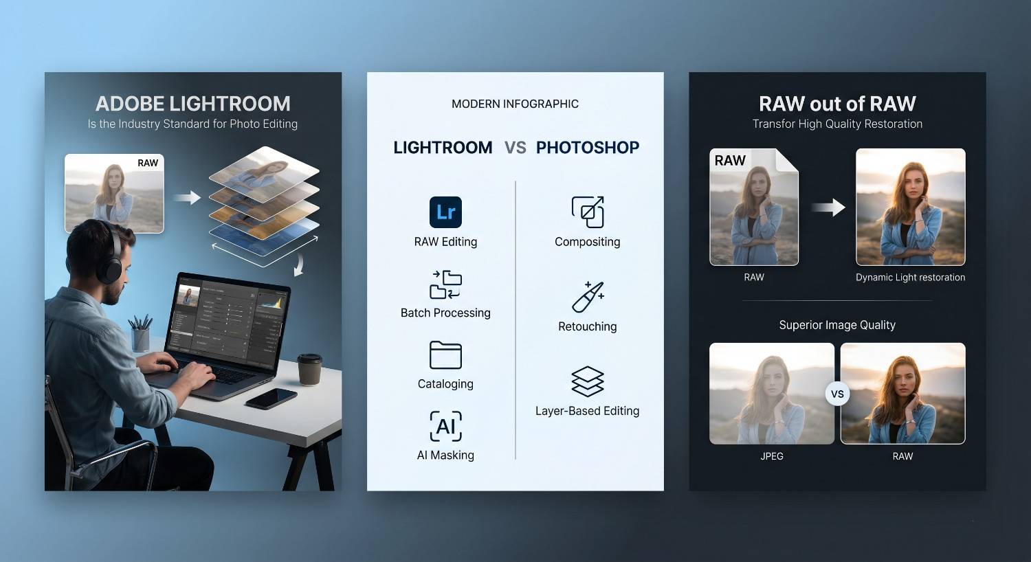
Adobe Lightroom holds its position as the go-to tool for professional photographers because it was built around a core principle most editing software ignores: your original file should never change.
Non-destructive editing means every adjustment exposure, color, sharpening is stored as a set of instructions, not baked into the pixel data. You can reset any edit at any time, return to a file you processed three years ago, and apply a different look in seconds. This is the foundation of a professional lightroom editing workflow.
Lightroom vs Photoshop: What’s the Difference?
Feature | Lightroom | Photoshop |
Primary use | RAW editing, batch workflow | Compositing, retouching |
Edit style | Non-destructive | Destructive (layers) |
Batch processing | Built-in, fast | Limited |
Cataloging | Yes | No |
AI masking | Yes | Yes (more advanced) |
Best for | Photographers | Designers & retouchers |
The clearest way to think about it: Lightroom handles the full photographic workflow. Photoshop handles pixel-level corrections that require layers. Most working photographers use Lightroom for 90% of their editing and only export to Photoshop for specific retouching tasks.
RAW Editing Advantages
Shooting RAW gives you a file with the full sensor data uncompressed, uninterpreted. JPEG files discard roughly 80% of that data when they’re created. In practical terms, RAW files let you recover two to three stops of overexposed highlights and pull significant shadow detail without the banding or noise artifacts you’d get from stretching a JPEG. Lightroom’s develop module is built specifically around RAW processing, which is why its tools, particularly exposure adjustment and white balance, produce cleaner results than general-purpose software.
Complete Lightroom Photo Editing Workflow (Step-by-Step)
A professional Lightroom workflow follows a fixed sequence. Jumping between color grading and basic adjustments wastes time and produces inconsistent results. Here’s the order that works.
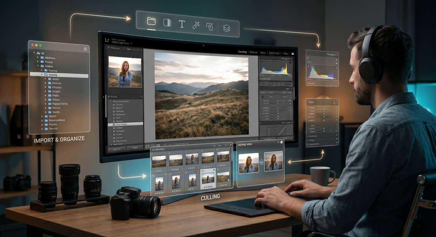
Step 1 – Import & Organize Photos Like a Pro
Import is not just moving files onto your hard drive. It’s the first editorial decision of your workflow.
Catalog system: Lightroom’s catalog is a database that tracks your photos, their locations, and every edit you’ve made. It doesn’t move or contain your images; it references them. Keep one main catalog. Splitting catalogs by project sounds organized, but creates friction every time you search for an image across multiple shoots.
Folder structure: Use a date-based hierarchy: Year > Month > YYYY-MM-DD_ShootDescription. This makes chronological browsing fast and works with Lightroom’s folder panel without needing manual reorganization.
Rating and flagging during import: Set your import to apply a basic develop preset (lens correction, noise reduction baseline) to every file on the way in. This saves time later. Don’t rate during import; you haven’t seen the images yet.
Step 2 – Culling (Selecting the Best Images)
Culling is where you decide which images deserve editing time. Most photographers spend twice as long here as they should because they don’t have a system.
Two-pass reject-first method:
- Pass 1 — Rejects only: Flag any image that’s out of focus, badly blown out, or a clear duplicate with a worse expression. Use X to reject. Move fast. You’re not selecting favorites, you’re eliminating failures.
- Pass 2 — Selects: From what remains, pick your best frames with P (Pick flag) or 1-star rating.
Speed culling with Survey View: Press N to enter Survey View and compare 3–5 similar shots simultaneously. This is significantly faster than comparing one-at-a-time for burst sequences.
After culling: Filter to flagged Picks only. Every image you edit from this point was deliberately chosen.
Step 3 – Basic Global Adjustments (Foundation Editing)
The Basic panel in Lightroom’s develop module is where technical image correction happens. Work strictly top to bottom.
Exposure adjustment in Lightroom: Set exposure for your subject, not the histogram. A general rule: expose for the subject, recover the rest with Highlights and Shadows.
Contrast balancing: Use the contrast slider lightly (+10 to +25). Refine contrast with the Tone Curve — it gives zone-specific control that the slider can’t match.
Highlights and shadows recovery: This is where RAW photo editing earns its value.
- Highlights: -40 to -80 for sky and window light recovery
- Shadows: +20 to +50 to open flat shadow areas
- Together, these two sliders balance light naturally without flattening the image.
White and black point clipping method: Hold Alt/Option while dragging Whites until the first clipping appears, then back off slightly. Repeat for Blacks in the opposite direction. This sets the full dynamic range without blowing out the image a standard technique in professional photo editing software workflows.
Step 3 Checklist:
- Exposure set for the subject
- Contrast: lightly set, refinement deferred to Tone Curve
- Highlights recovered, Shadows opened
- White/black points set with Alt/Option clipping preview
Color Correction & Color Grading (Style Building Phase)
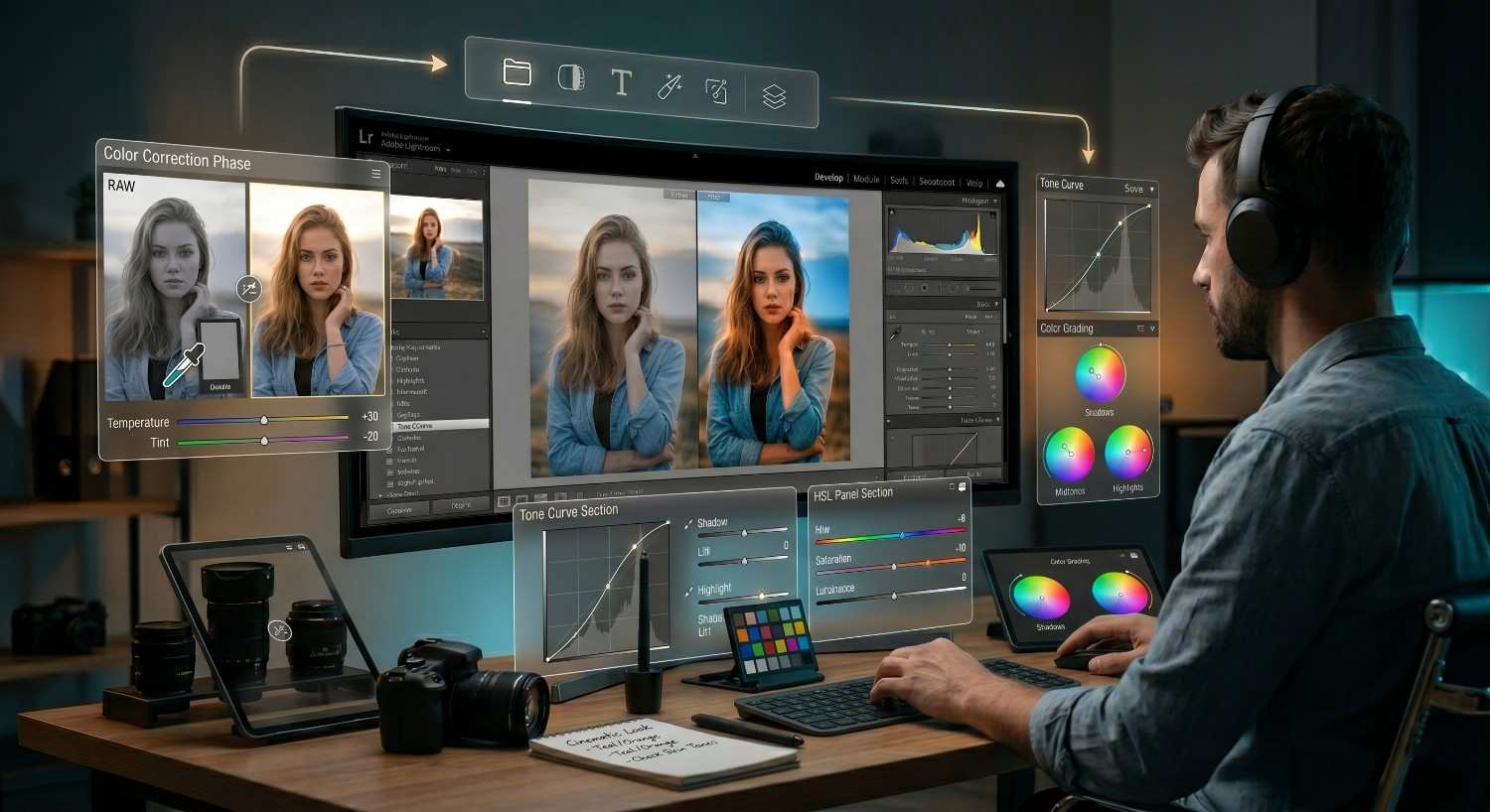
Color work happens in two stages: correction (making the image accurate) and grading (making the image intentional). Do them in that order.
White Balance Mastery
Temperature vs tint control: Temperature adjusts the blue-to-yellow axis. Tint adjusts the green-to-magenta axis. For most color cast correction, temperature handles 80% of the work. If a white wall still looks slightly off after adjusting temperature, tint is usually the fix.
Fixing color casts: The fastest method is using the eyedropper tool on a neutral surface white paper, gray card, cloudy sky. For images without a neutral reference, adjust temperature until skin tones look natural and cross-check against any white objects in the frame.
Tone Curve for Professional Contrast
The tone curve is where professional contrast control happens. The Basic panel’s contrast slider moves the whole tonal range at once. The tone curve lets you control specific zones.
S-curve technique: Add a slight lift to the shadows (pull the bottom-left anchor point up slightly) and a slight drop to the highlights (pull the top-right anchor point down slightly), with a standard S-shape through the midtones. This creates a cinematic contrast look rich midtones, controlled shadows, and clean highlights that the contrast slider can’t replicate.
Cinematic contrast control: For a more stylized look, flatten the shadows by lifting the bottom anchor point (raising black point on the curve) and keeping highlights controlled. This produces the lifted-shadow, “film-like” tone curve look common in editorial and fashion work.
HSL Panel (Pro Color Control)
The HSL (Hue, Saturation, Luminance) panel lets you adjust individual colors independently. It’s one of the most powerful tools in Lightroom for targeted color control.
Adjust individual colors: Use the targeted adjustment tool (circle icon in the HSL panel) and drag directly on the image. Clicking on a blue sky and dragging down desaturates only that specific shade of blue without touching anything else.
Skin tone correction: Skin tones fall primarily in the orange and red channels. If skin looks too red, reduce red saturation slightly and increase orange luminance to brighten without washing out. If skin looks sallow, increase orange saturation moderately and check the hue slider isn’t shifted too far toward yellow.
Background enhancement: For outdoor portraits, increasing the luminance of greens and blues separately gives you precise control over background brightness without affecting the subject.
Color Grading Tool
The Color Grading tool (formerly Split Toning) lets you apply different color tones to shadows, midtones, and highlights independently.
Shadows / midtones / highlights styling: A common approach for a warm, cinematic look: add a slight orange/amber to midtones, a small blue or teal shift to shadows, and leave highlights neutral or slightly warm. This creates depth in the color without looking obviously filtered.
Creating cinematic looks: The most used professional approach is a cool-shadow, warm-highlight split. Set shadows to a hue around 210–230 (blue-teal range) with low saturation (5–12), and highlights to a hue around 30–50 (warm orange-amber) at similar low saturation. Subtlety is the difference between cinematic and processed.
Advanced Lightroom Editing Techniques
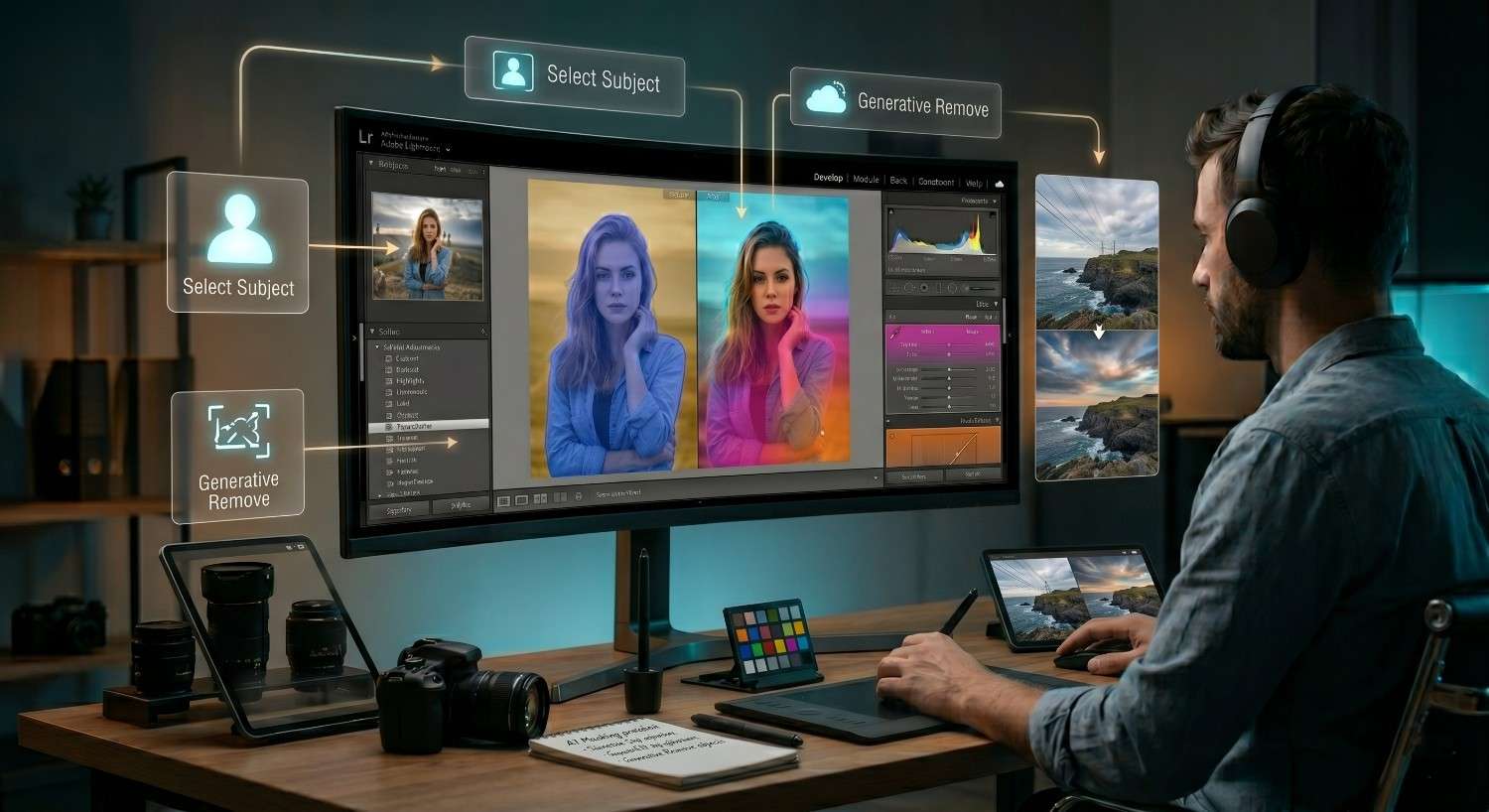
AI Masking & Local Adjustments
Lightroom’s AI masking tools changed local adjustment work significantly. What previously required careful manual brushing can now be done in one click.
Subject selection: The “Select Subject” mask uses AI to isolate your main subject automatically. In our tests, it handles complex hair edges and overlapping backgrounds with about 85–90% accuracy on standard portrait setups, requiring only minor refinement brushing on edges.
Sky replacement editing: “Select Sky” creates a precise sky mask for targeted exposure and color adjustments. This is particularly useful for landscape work where sky exposure differs significantly from foreground exposure. Bring down sky highlights, boost saturation selectively, and add a blue or cyan shift all without touching the foreground.
Background control: Use “Invert” on a Subject mask to select the background. Then apply a slight blur (texture: -30 to -50), desaturation, or exposure reduction to separate the subject from a distracting background without compositing.
Graduated & Radial Filters
Lighting control: The Graduated Filter (Linear Gradient) works like a physical ND grad filter feathered adjustments across a defined edge. Apply from the top to darken skies, or from the bottom to add ground detail.
Focus direction techniques: A Radial Filter centered on your subject with a slight exposure boost (+0.3 to +0.5) and a feathered falloff creates a natural vignette effect that draws the eye to the subject. Invert the mask and darken outside the ellipse for a more pronounced effect.
Generative Remove Tool (AI Cleanup)
Lightroom’s Generative Remove tool uses Adobe’s AI to remove unwanted objects from images and synthesize replacement content.
Removing unwanted objects: Paint over the object (tourist in a landscape, sensor dust, distracting sign) and Lightroom generates plausible replacement content based on surrounding pixels. For small, isolated objects on uniform backgrounds (sky, grass, plain walls), results are production-ready. For complex objects near edges or in busy areas, expect to refine.
Clean composition workflow: Use Generative Remove as a final cleanup step, after all color and tone work is done. This avoids editing artifacts in removed areas that might become obvious after sharpening or noise reduction is applied.
Presets & Speed Editing Workflow
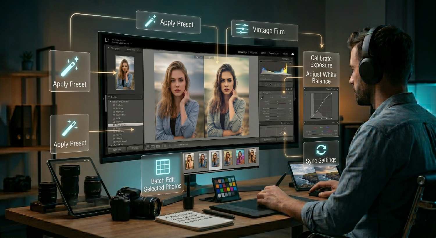
A Lightroom preset is a saved set of develop settings nothing more, nothing less. The confusion around presets comes from marketing. Presets don’t “transform” photos. They apply starting points.
What presets actually do
When you apply a preset, Lightroom moves specific sliders to predefined positions. If your starting exposure or white balance is different from the photo the preset was designed on, the result will look different. Presets require calibration to each image.
How professionals use presets
Working photographers use presets as a first-pass foundation, not a finished product. Apply the preset, then spend 2–3 minutes calibrating exposure, white balance, and HSL to the specific image. The preset eliminates the setup time; it doesn’t eliminate the editing time.
Creating Custom Presets for Your Style
Build your preset from a well-exposed, neutrally lit image. Save only settings you want applied globally:
- Tone curve shape
- Color grade split
- Lens corrections
- Noise reduction baseline
Exclude settings that need per-image calibration: exposure, white balance, shadows, highlights.
Batch Editing Workflow in Lightroom for Consistency
After editing one strong image from a shoot:
- Select the edited image in the Library or Develop module
- Select all target images (Ctrl/Cmd + A on filtered selects)
- Click Sync Settings
- Deselect Exposure and White Balance (these vary per image)
- Apply Lightroom pushes the synced settings across all selected files
Detail Enhancement & Image Quality
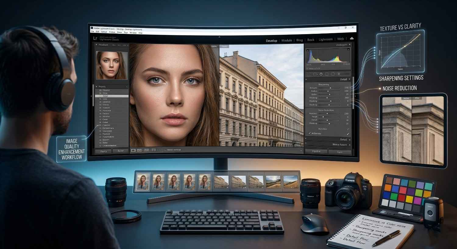
Sharpening Settings Explained
Lightroom’s sharpening works in the Detail panel. The default settings (Amount: 40, Radius: 1.0, Detail: 25) are a reasonable baseline for most RAW files.
For portraits: keep Amount between 40–60, use a low Detail value (15–20) to avoid sharpening skin texture, and use the Masking slider (hold Alt/Option to preview) to restrict sharpening to edges only, typically a Masking value of 60–80.
For landscapes and architecture: increase Amount (60–80), raise Detail (35–50), and use lower Masking (20–40) since edge contrast is less of a concern.
Noise Reduction for High ISO Images
Lightroom’s AI-powered Denoise tool (available in current versions) significantly outperforms the legacy Luminance and Color noise reduction sliders. For images shot above ISO 3200, use Denoise first, then apply sharpening. Sharpening after noise reduction produces cleaner edges than the reverse order.
For legacy noise reduction: set Color noise reduction to 25 as a baseline for all files (it handles chroma noise without softening detail), and adjust Luminance based on ISO minimal for ISO 800 and below, increasing progressively for higher ISOs.
Texture vs Clarity
- Texture affects mid-frequency detail (skin pores, fabric, bark). Use +15 to +25 for landscapes and product work.
- Clarity affects broader edge contrast. High Clarity creates an HDR look — use sparingly.
- For portraits: Reduce Texture (-10 to -20) on skin areas using a Subject mask. Keep Clarity neutral or slightly negative (-5 to -10).
Avoiding Over-Editing Mistakes
The most common sign of over-editing: the image looks better on the screen that processed it than on any other screen. Calibrate your monitor. Check your edits on a phone or second screen before delivery. If the colors look dramatically different, your editing environment is misleading you.
Professional Export Settings (Final Step)
Export settings determine how your finished image is delivered. The wrong settings cost you image quality, file size, or both.
JPEG vs TIFF vs DNG
Format | Use case | File size | Quality loss |
JPEG | Web, social, client delivery | Small | Lossy (minimal at Quality 90+) |
TIFF | Print, archiving, Photoshop handoff | Large | None |
DNG | RAW archiving, sharing editable files | Medium | None |
For most delivery scenarios: JPEG at Quality 90–95 is indistinguishable from TIFF for screen viewing and produces files clients can open without specialist software.
Social Media Export Settings
- Instagram / Facebook: sRGB color space, JPEG quality 90–95, resize to 2048px on long edge, 72 PPI
- Print-at-home / lab uploads: sRGB or AdobeRGB (check with lab), JPEG quality 100 or TIFF, 300 PPI, at print size
- Portfolio websites: sRGB, JPEG quality 85–90 (balance quality vs load time), 2000–2560px long edge
Print-Ready Export Settings
For professional labs: export as TIFF (no compression), AdobeRGB color space, 300 PPI at the intended print dimensions. Confirm with your lab whether they prefer sRGB or AdobeRGB this varies by printer and ink profile.
Resolution & Compression Best Practices
PPI (pixels per inch) only matters at print. For screen delivery, PPI is irrelevant what matters is pixel dimensions. A 6000 x 4000px image displayed at 72 PPI or 300 PPI on a screen looks identical.
Use Lightroom’s export resize tool (Resize to Fit: Long Edge) rather than resizing in Photoshop. Lightroom’s default export sharpening (Standard, Screen) applies a slight output sharpening pass appropriate for the destination use it.
Common Lightroom Editing Mistakes to Avoid
Overexposure mistakes: Clipped highlights (pure white with no detail) are not recoverable in post. If you’re pushing exposure up and the Histogram shows clipping at the right edge, pull highlights and whites down before adding more exposure.
Oversaturated colors: The Vibrance slider is context-aware and protects already-saturated colors. The Saturation slider is not — it lifts everything uniformly. Most images need Vibrance, not Saturation. When in doubt: if the colors look great in isolation but wrong next to skin tones, Saturation is the culprit.
Over-sharpening: Sharpening that’s visible at 100% zoom will be even more visible in print. If you can see sharpening halos around edges at full zoom, you’ve gone too far. Pull Amount down and raise Masking.
Ignoring workflow order: Editing color before fixing exposure produces inconsistent results because color perception is tied to brightness. Fix exposure and white balance first. Add color grading last. Skipping the order forces you to redo earlier work.
Lightroom Editing Tips Used by Professionals
Edit in stages, not randomly: Complete each panel before moving to the next. Finish the Basic panel before opening HSL. Finish masking before noise reduction. Random jumping between tools wastes time and produces edits that fight each other.
Always zoom in and out during editing: Make adjustments at full view (Fit in Window), then check critical areas at 100% zoom. Details like skin texture, eye sharpness, and noise are invisible at fit view. Finish at fit view to check the overall look.
Compare before/after frequently: Use the backslash key (\) to toggle before/after. Do this every 5–10 minutes while editing. Editors who rarely compare lose perspective and over-edit. The before/after check resets your eye.
Maintain consistency across images: After completing an edit you’re happy with, use that image as the reference for the rest of the set. Sync settings where appropriate, and adjust per-image calibrations (exposure, white balance) individually. Consistency across a set of photos is what separates professional delivery from a collection of technically good individual images.
FAQ’s
Is Adobe Lightroom good for beginners?
Yes. Lightroom’s develop module is specifically designed for photographers without retouching backgrounds the Basic panel handles the majority of edits most images need, and the interface is organized to guide you through a logical sequence. The learning curve is real but manageable; most beginners produce competent edits within their first two hours.
What is the best workflow in Lightroom?
The most reliable Lightroom workflow follows this sequence: import and organize, cull to select best images, apply global adjustments (exposure, white balance, tone curve), then color grading, then local adjustments using masks, then detail (sharpening and noise reduction), and finally export. Working in this order prevents you from re-doing earlier decisions and keeps the editing process linear.
Lightroom vs Photoshop: which is better?
For photo editing and workflow, Lightroom is better it handles RAW files, batch editing, cataloging, and color work in one tool. Photoshop is better for compositing, advanced retouching, and anything requiring layer-based editing. Most working photographers use both: Lightroom for the full workflow, Photoshop for specific images that need pixel-level work.
Do professionals use Lightroom presets?
Yes, but not as finished edits. Professionals use presets as starting points that set a color grade or tonal foundation, then calibrate each image individually for exposure and white balance. Presets save setup time, but they don’t replace editing judgment. The best professional preset is one you built from your own style rather than a purchased pack.
Final Thoughts
Lightroom is a system, not a series of random moves. A structured workflow import, cull, basic adjustments, color work, local adjustments, detail, export produces consistent, professional results faster than approaching each image differently. The photographers who produce the most reliable output aren’t necessarily the most creative editors; they’re the ones who’ve built a process they repeat.
Key takeaways:
- Workflow order matters. Fix exposure and white balance before color grading. Complete global adjustments before local ones. Export last.
- Non-destructive editing is the foundation. Every setting is reversible. Use this experiment without fear, and return to adjust any decision you make today.
- Consistency beats perfection. A set of 50 images with a coherent, controlled look is worth more professionally than 50 individually perfect photos that don’t belong together.
Practice on images that matter to you a trip, a portrait session, a project you actually care about. The technical skills build through repetition. The workflow becomes instinct within weeks of consistent use.